
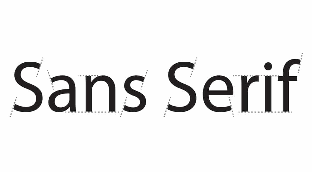
Have you ever looked at a sign or a website and noticed how clean the letters look? Chances are, you were looking at a sans serif font. This style of writing is everywhere today. From your phone screen to big billboards, it helps us read faster and easier. At TypeType, we spend our days making beautiful sans serif fonts for everyone. In this blog, we will talk about why these fonts are so special. We will keep everything simple and clear, just like the fonts themselves.
What Exactly is a Sans Serif Font?
The name sans serif comes from old French words. “Sans” means without. So a sans serif font is a font without small lines at the ends of letters. Think of the letter “T” in a book. If it has little feet, it is a serif font. If it is just a straight line, it is a sans serif. This simple style makes text look modern and clean. It feels open and friendly to the eyes. Many people call it a “gothic” or “grotesque” font, but today we just call it normal and simple.
A Quick Look Back in Time
People did not always use sans serif fonts. A long time ago, all books used serif fonts. Then in the 1800s, companies wanted bold posters. They started using thick sans serif letters to grab attention. These early versions looked strong and heavy. Later in the 1900s, artists in Germany made them popular again. They loved the clean shapes. This is how the sans serif began its journey to becoming a favorite choice for designers worldwide.
The Geometric Style
One popular type of sans serif is called geometric. Here, letters are made using circles and straight lines. The letter “O” looks like a perfect circle. The letter “A” looks like a triangle on a stick. This style feels very organized and smart. It gives a feeling of order and new ideas. Many tech brands use a geometric sans serif to look fresh and modern. It is perfect for logos and headlines where you need a strong look.
The Humanist Style
Another kind is the humanist sans serif. This style borrows shapes from old handwriting. The letters are not perfectly round. They have more flow and softness. This makes them easier to read in long books or articles. A humanist sans serif feels warm and natural. It is like a friendly voice talking to you. Schools and hospitals often use this style. It makes people feel calm and welcome. The letters are simple but have a gentle touch.
Why Sans Serif is So Easy to Read
Reading on a phone or computer can hurt our eyes after a while. But sans serif fonts help reduce that strain. Because the letters are clean, they do not blur on screens. Small lines on serif fonts can disappear on low-quality displays. With a sans serif, every letter stays clear. This is why most websites and apps use them for main text. They make reading comfortable even for hours. Simple shapes mean your brain works less to understand the words.
Perfect for Small Screens
Think about your smartwatch or the tiny text on a button. A sans serif shines in these small spaces. The letters remain sharp and easy to recognize. At TypeType, we test our fonts on many devices. We want our sans serif fonts to look good everywhere. From a huge billboard to a tiny app icon, the quality stays the same. This is very important for brands that want a consistent look across all platforms.
Helpful for All Readers
Some people have trouble reading because of dyslexia or weak eyesight. For them, a sans serif can be a big help. The simple letter shapes are easier to tell apart. There is less clutter around each character. This makes words less confusing. When we design fonts at TypeType, we think about everyone. We want our sans serif fonts to be open and accessible. Good design should work for all people, no matter their reading level.
How Brands Use Sans Serif Today
Big companies love the sans serif for a reason. It makes them look honest and direct. A clean font says, “We have nothing to hide.” It also feels modern and forward-looking. When you see a brand using a sans serif logo, you think of innovation. This style works for banks, food brands, and fashion labels alike. It is like a blank canvas that lets the brand’s message come through without distraction.
Showing Off a Modern Image
In the old days, fancy fonts with decorations meant luxury. Today, simple sans serif fonts mean luxury too. Clean spaces and simple lines show confidence. A brand does not need extra swirls to prove its value. Using a sans serif says, “We are sure of ourselves.” This is why car companies and phone makers use them. They want to appear sleek, fast, and simple to use. The font becomes part of the brand’s promise.
One Font for Everything
A good sans serif font family has many weights. You can get a thin version for small text and a bold version for titles. This means a brand can use the same sans serif everywhere. On a poster, it looks strong. On a website, it looks friendly. Having one font for all uses creates a strong brand identity. At TypeType, we create font families with many options. Designers can pick the right weight for any job while keeping the same style.
TypeType and Our Love for Sans Serif
At TypeType, we believe sans serif fonts are the future. Our team works hard to make fonts that are both beautiful and useful. We study every curve and space between letters. We want our fonts to feel right when you read them. Whether you need a font for a big company or a small blog, we have a sans serif for you. Our goal is to give designers tools that make their work look professional and polished.
Getting the Small Details Right
Making a great sans serif is not as easy as it looks. Every letter must have the right balance. The space between letters must be perfect. If it is too tight, words become hard to read. If it is too loose, the text looks broken. At TypeType, we spend months fixing these details. Our sans serif fonts work in many languages too. We make sure they look good from English to Hindi. This global thinking sets our fonts apart.
Discover Our Font Collection
We have many sans serif fonts waiting for you. Our TT Commons family is a favorite among designers. It is clean, modern, and very useful. We also have fonts with more personality, like TT Norms Pro. Each font in our sans serif collection has a unique feel. You can explore them on our website. See which one matches your project. We are sure you will find a sans serif that speaks to you. Great design starts with the right letters, and we are here to provide them.
The story of the sans serif is still being written. Every year, new styles appear. But the core idea stays the same: simple is strong. These fonts help us share ideas without noise. They connect people across the world through clear text. As screens get smaller and life gets faster, sans serif fonts will become even more important. At TypeType, we are excited to be part of this journey. We will keep making fonts that help you share your story in the clearest way possible.
Conclusion
To put it simply, a sans serif font is like a good friend. It is honest, easy to understand, and always there when you need it. These fonts make our digital world a nicer place. They remove confusion and let the message shine. If you are starting a new project, think about using a sans serif. And when you need a high-quality font, remember TypeType. We create fonts that bring warmth and clarity to your words. Thank you for reading and happy designing.